Lipton
Pickle Tea
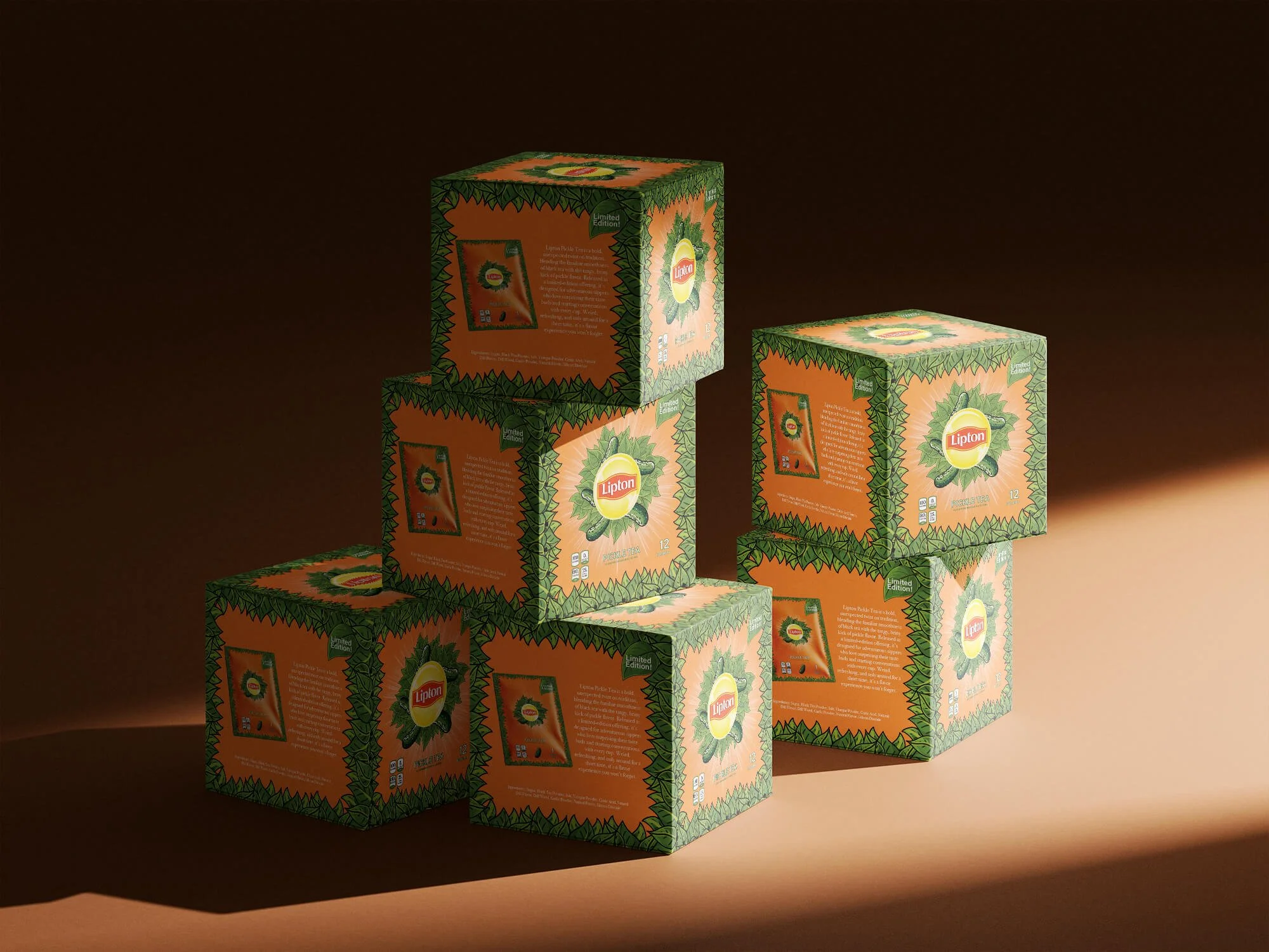
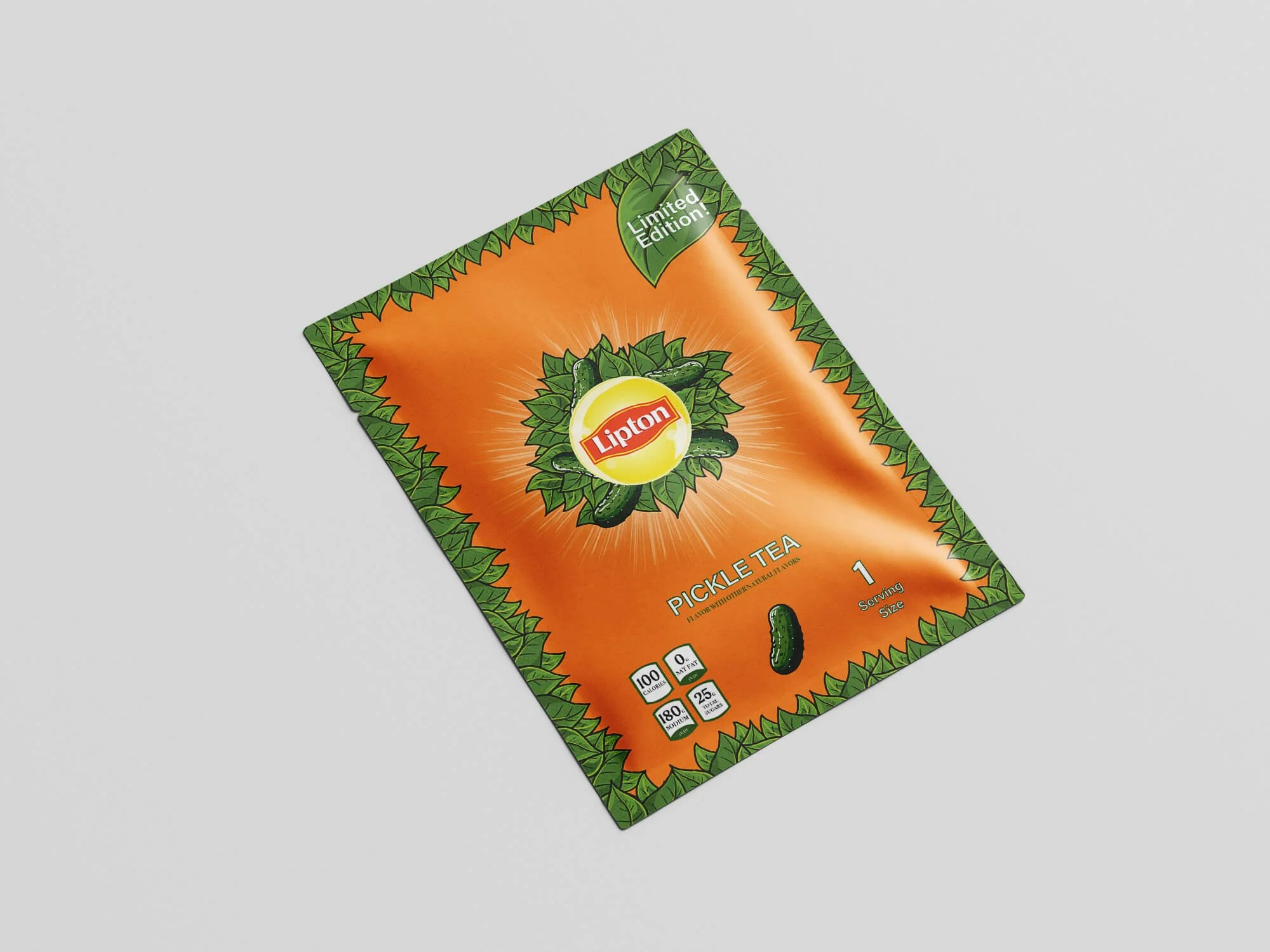
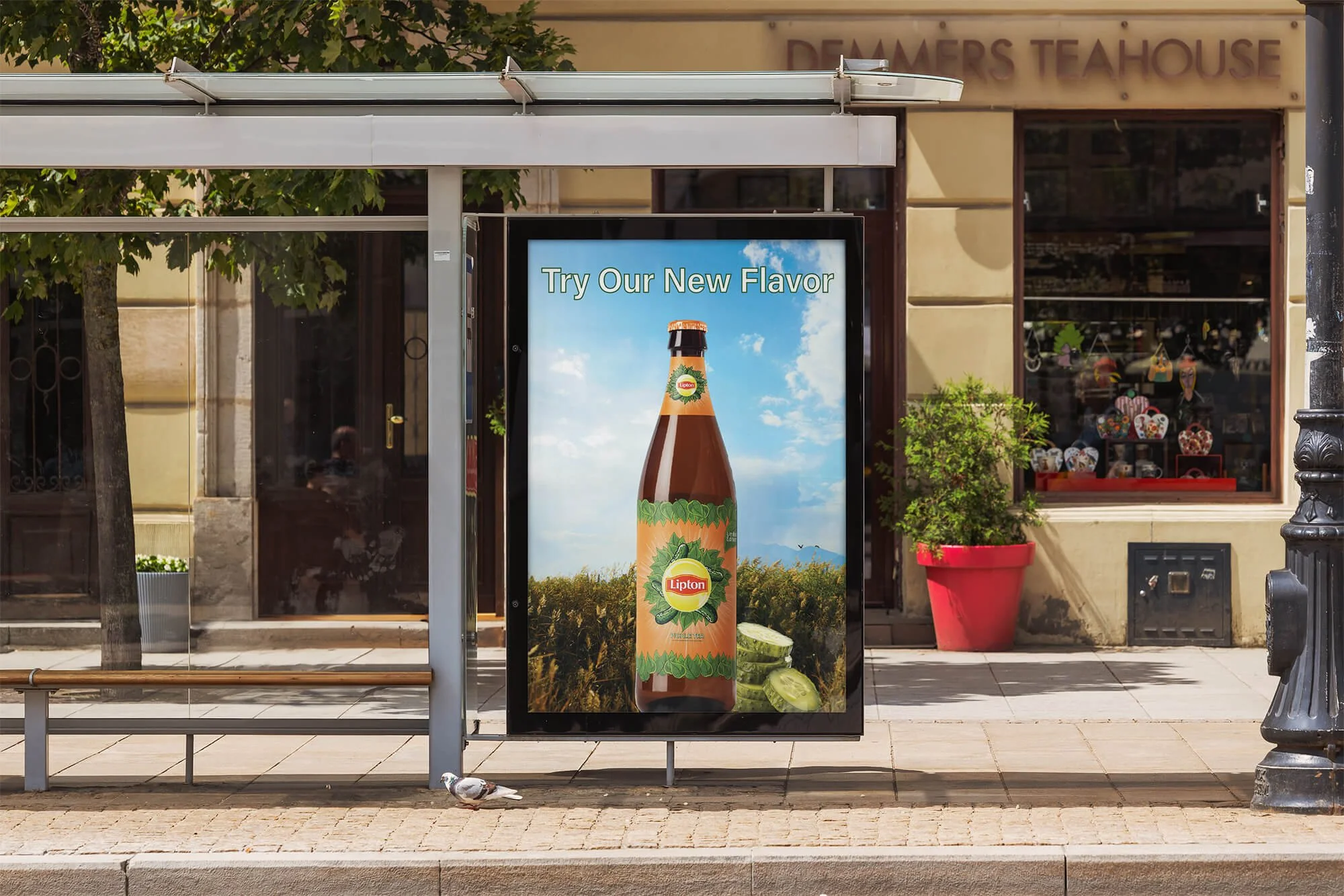
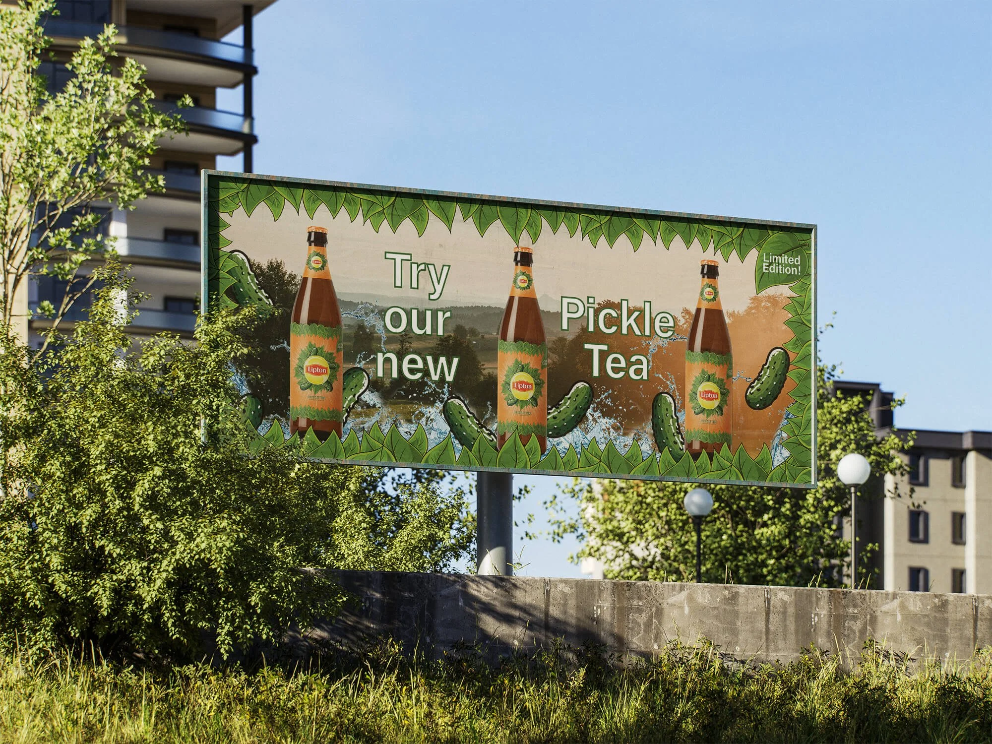
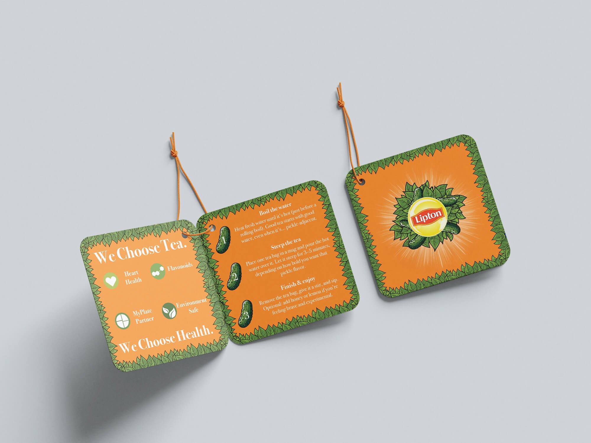
The Lipton Pickle Tea branding playfully reimagines the classic look of Lipton while staying true to its recognizable identity. The packaging features a bold, vibrant contrast of bright orange and fresh green, capturing both the energetic essence of the brand and the tangy personality of pickle flavor. The green pickle illustrations are designed to seamlessly match Lipton’s previous package style—clean, eye-catching, and centered within the brand’s iconic layout—so the concept feels both surprising and authentically Lipton. The result is a fun, cohesive design that balances humor with strong shelf appeal.